CASE STUDY / ICONŚ MARBELLA
ICONŚBuilding a premium wellness brand from positioning to launch.
- Brand Strategy
- ·Visual Identity
- ·Digital Design
- ·Campaign
- ·Brand Experience
01 / OVERVIEW
What began as a website brief evolved into a connected brand system across digital, physical and operational touchpoints.
WHAT ICONŚ IS
- Premium wellness club
- Golden Mile, Marbella
- British founders, pre-opening
WHAT I OWNED
- Positioning & identity system
- Website & campaign design
- Brand experience & delivery
02 / FINDING THE POSITION
Two markets, one position
ICONŚ was launching in Marbella, but its British founders were familiar with the UK's premium fitness market and had ambitions beyond Spain. I therefore looked at both Marbella's local competitive landscape and established UK category benchmarks.
MARBELLA
Direct market landscape — the clubs a member would actually choose between on the Golden Mile.
UK
Category benchmarks only — reference points for premium standards, not competitors in Marbella.
Luxury wellness
Polished and restorative, but often visually passive.
Performance fitness
Credible and energetic, but often visually aggressive.
Lifestyle clubs
Aspirational and social, but less performance-led.
THE OPPORTUNITY
Position ICONŚ between performance and lifestyle — premium, but not precious; energetic, but not aggressive.
03 / BUILDING THE IDENTITY
The position translated into a system: one mark, one typeface family, a restrained palette and rules for photography.
SCROLL — BRAND SYSTEM
THE MARK
Clear space, permitted backgrounds and the ranked lockups — the parts a small team needs in order to apply the mark without supervision.
COLOUR — 01 / 05 · PRIMARY
Navy Blue
#3D515E
TYPE
Display
Wellness Gets An Address
Heading
Move. Restore. Connect.
Body
A premium wellness club on the Golden Mile, built for members who want performance and calm in the same place.
Caption
Golden Mile, Marbella
One family, clearly ranked roles, with italic reserved for standfirsts and pull quotes. The guidelines specify Cera; this page renders the specimens in the closest available web substitute.
PRINCIPLE 01
Premium,not exclusive.
PRINCIPLE 02
Restrained,not sterile.
PRINCIPLE 03
Energetic,not aggressive.
PHOTOGRAPHY
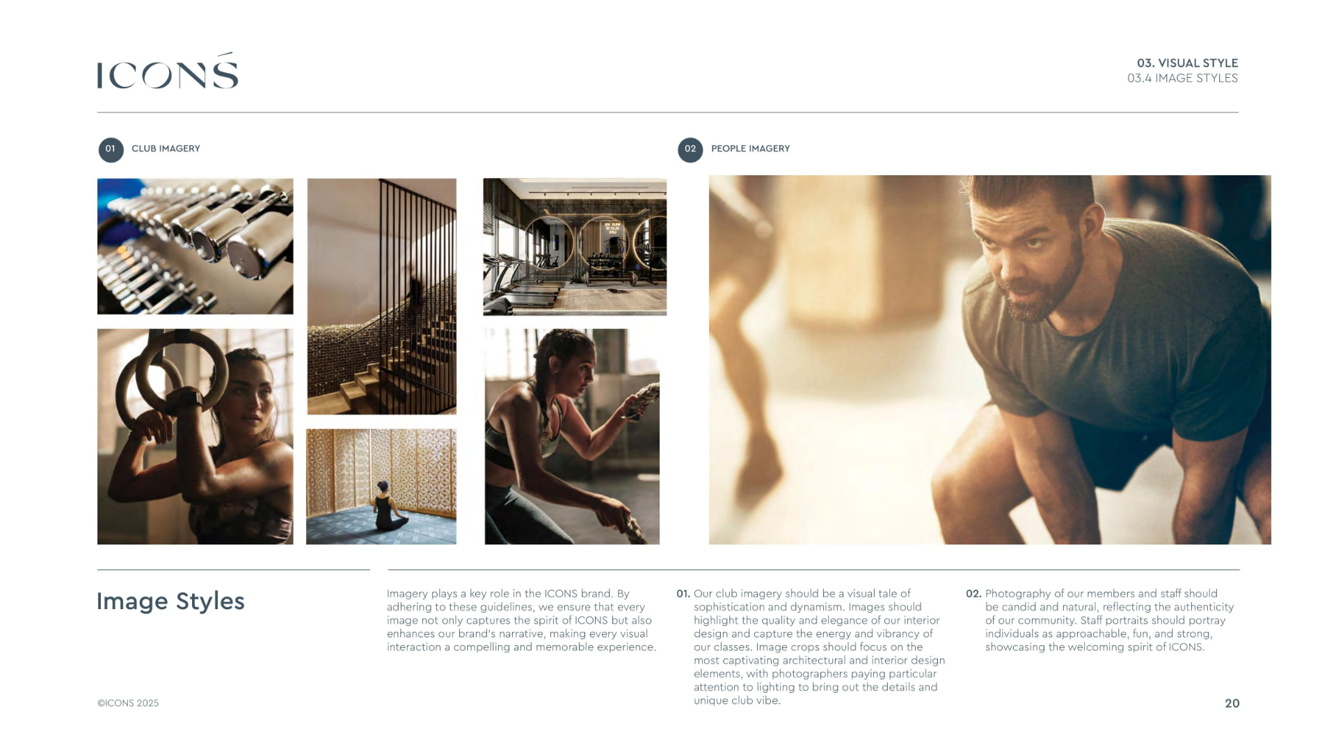
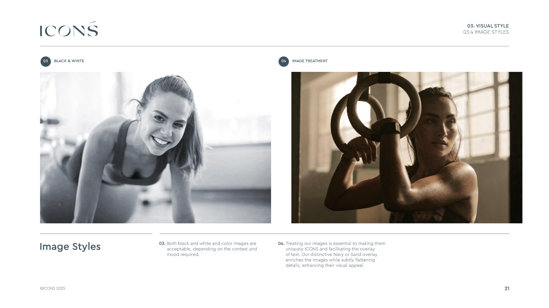
Crop, tone and how brand elements sit over an image.
Photography carries the premium read, so the rules define what an ICONŚ image is allowed to be — people in real space, warm tone, generous air.
THE SYSTEM, TOGETHER
MARK
Wellness Gets An Address
TYPE
COLOUR
Mark, type, colour and photography working as one language — the point where the identity was ready to be applied to the website, the campaign and the club.
04 / BRINGING IT TO LIFE
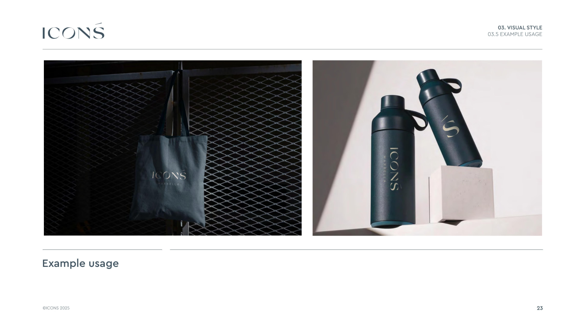
One brand across digital, campaign and club
DIGITAL EXPERIENCE
Website Architecture & Wireframing
I mapped the website as a modular system across membership, classes, trainers, recovery, content and conversion journeys before moving into high-fidelity design.
CAMPAIGN & PHYSICAL TOUCHPOINTS
INSIDE THE CLUB
05 / CONNECTING THE JOURNEY
Designing how the brand actually operated
The team wanted to know whether pre-opening passes were converting. Nothing connected who shared a pass, who registered, and who used it.
- Campaign
- →QR / referral
- →Website
- →Mailchimp
- →Technogym
- →Club experience
Each team member's QR code carries a unique ref parameter, the registration form stores that ref in Mailchimp, and Technogym logs activation and later visits — so acquisition, CRM and the club floor read as one journey.
06 / OUTCOME
What changed
WEBSITE BRIEF
Complete brand system
UNDEFINED POSITIONING
Clear premium market position
DISCONNECTED TOUCHPOINTS
Consistent brand experience
LIMITED JOURNEY VISIBILITY
Trackable customer journey
What began as a website brief became a connected brand and digital ecosystem.
Note on scope: this case study shows the work as designed and delivered. Campaign performance sat with the client's own reporting, so no results are claimed here.